Text Formatting & Content Structure
Clear, well‑structured documents and content are useful for everyone, and essential for learners using screen readers, magnification, or other assistive technologies. Use the following guidance to make sure your Word, PowerPoint, D2L pages, and PDF files are readable and accessible.
What is accessibly formatted text?
Accessibly formatted text is one that is easy to perceive and read—typically a sans-serif typeface with sufficient size, spacing, and contrast against the background so that text is distinguishable without relying on shape or style alone. This means you should:
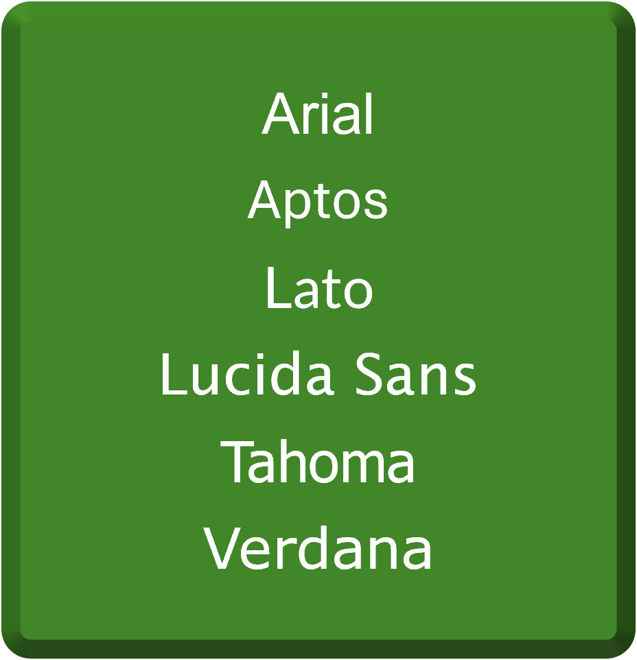
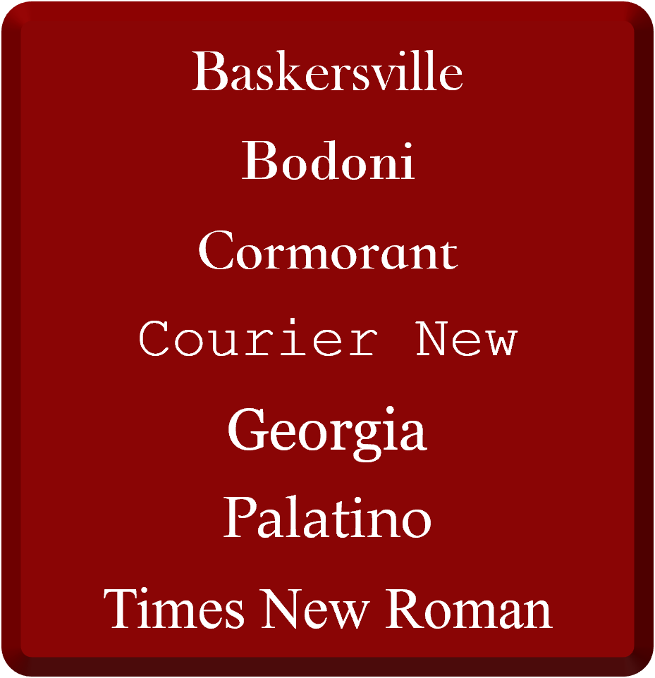
Any text you use should be 12 pt or larger for on‑screen readability and use sans-serif fonts, like Arial, Calibri, or Verdana. Sans-serif don’t have the little decorative lines on the ends of letters, making them easier for most people to read. Here are more examples of both serif and sans-serif fonts:
|
|
|
|---|---|
Sans-Serif Fonts
|
Serif Fonts
|
Text should have a contrast ratio of at least 4.5:1 to the color behind it. Here are some examples of high contrast (ideal) and low contrast text:
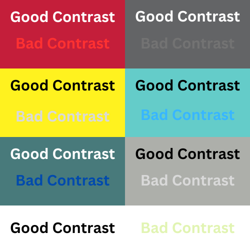
Generally, black text on a white background is the most recommended, as this combination offers optimal contrast and benefits a majority of users.
When you need to emphasize text, you will want to use bold/italics and not rely on text color alone. Use bold and italics sparingly because it can reduce readability for some users and overuse creates visual clutter. An alternative is adding a prefix "Note:" or "Important:" to get users' attention. Do not use underline for emphasis as these can be mistaken as broken hyperlinks.
For tool specific assistance on making accessible text, please checkout the following guides/videos:
What is accessibly structured content?
Accessibly formatted content is one that uses true structural elements so that both visual readers and assistive technologies can navigate and understand the content effectively. This means you should:
Every document, slide, or HTML-based content should have meaningful titles or headers that use the proper style format for headings so users understand context and can navigate quickly. Like a table contents, these headings should following a clear hierarchy (heading level 1, heading level 2, heading level 3, etc.) and be short and descriptive in nature. For more information on how to do this in specific tools, please review the following guides/videos:
When listing, you should use the built‑in bulleted or numbered list tools. Proper lists convey structure to assistive technologies. Don't type dashes or numbers manually. For more information on do this in specific tools, please review the following guides/videos:
You should review the content to ensure it is presented in the intended sequence for both sighted users and those using screen readers. Visual order and screen reader order can differ based on on a variety of reasons. This can be reviewed and remediated using the accessibility checker within each tool. For more information on how to do this in specific tools, please review the following guides/videos:
Why is accessibly formatted text and structured content important?
Accessible content is important because it ensures that all users—including those with disabilities—can perceive, navigate, and understand the content, meeting WCAG 2.2 standards, and reducing barriers to learning. Accessible fonts and high contrast text are vital for universal design, enhancing readability to make reading the text in a course easier for all learners (not just those with visual impairments).
Tips & Tricks
-
To ensure accessibility, use the built-in accessibility checkers available in applications, such as Microsoft Office Suite and Adobe Acrobat. Additionally, WebAIM (Web Accessibility In Mind) provides a color contrast checker designed to verify the best contrast between fonts and backgrounds. Utilize these checkers to identify and address any font-related accessibility issues.
-
You can customize your preferred heading styles in Microsoft Word to save time and keep your documents consistent.
For tool specific assistance on structuring and formatting accessible content and documents, please checkout the following guides/videos: